How to Coordinate Paint Colours With Your Existing Décor

Choosing the right paint colours has the power to completely transform a space, but it involves more than simply picking a shade you like. For a cohesive and refined look, it is essential to ensure your colour choices complement your existing décor.
From furniture and rugs to artwork and lighting, every element contributes to the overall tone and style of a room. Whether you aim to highlight bold patterns, enhance neutral tones, or refresh your walls, coordinating paint colours doesn’t have to feel overwhelming. This blog provides practical, straightforward tips to simplify the process and help you create a space that reflects your unique vision.
The Importance of Coordinating Paint Colours

Choosing the right paint colours is fundamental to creating a cohesive and visually appealing space. Not only do colours set the mood and define the style of a room, but they also play a significant role in tying together different design elements.
When properly coordinated, paint colours unify a room, establishing harmony and balance. In contrast, mismatched or clashing colours can create a disjointed and uninviting atmosphere.
One of the key benefits of coordinating paint colours is the sense of flow and continuity it brings to your home. Using complementary colour schemes across different spaces fosters connection and cohesion, enhancing the overall design. Furthermore, the right colours can influence how a space is perceived. Lighter shades or complementary tones can make a room feel larger and more open, while darker hues create a more intimate and cosy environment.
Coordinating paint colours also allows for seamless integration of various textures and patterns in your décor. By selecting complementary or matching tones, you can confidently mix furniture, fabrics, and accessories without the risk of clashing, resulting in a polished and professional aesthetic.
Is it Possible to Match an Existing Wall Paint Colour?
Matching an existing wall paint colour is possible with a few smart strategies. Start by checking if you have leftover paint or a record of the original colour name and brand. If not, take a paint chip from an inconspicuous area, such as behind a switch plate, to your local paint store.
Professionals can use colour-matching machines to create a close match. Alternatively, try a smartphone colour-matching app for convenience, but remember these tools may not be as precise. Keep in mind that factors like lighting and paint fading over time can affect the match. Test samples on your wall to find the closest shade.
If an exact match isn’t possible, consider repainting the entire wall or using a complementary colour for seamless blending. By following these tips, you can restore or refresh your space effortlessly.
How to Coordinate Paint Colours With Your Existing Décor
Choosing a new paint colour might seem like a fun design task, but it often comes with one big challenge: ensuring it blends seamlessly with your existing décor. Whether you’re working with cherished furniture pieces, heirloom rugs, or a fixed kitchen splashback, selecting the right paint shade requires careful coordination—not just guesswork.
The aim is to create a space that feels cohesive, balanced, and thoughtfully designed. With a few smart strategies and an understanding of how colour works in your space, you can confidently choose paint colours that enhance your existing décor rather than clash with it.
1. Start With What You Have
Before diving into paint samples, take a step back and assess your current space. What are the dominant colours in your furniture, flooring, and accessories?
Look at:
Upholstery fabric and patterns
Rugs and carpets
Cabinetry and worktops
Flooring tones (wood, tile, or laminate)
Artwork and decorative accents
Pick up on repeating tones, even subtle ones. Do you notice warm earth tones, cool blues, or neutrals like beige or grey? These clues help you narrow down your paint palette.
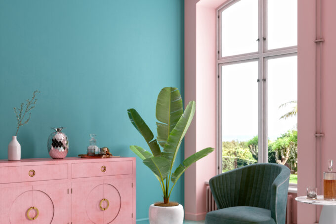
2. Understand Undertones
Many paint colours have undertones—subtle hints of other hues—that may not be obvious at first glance. A grey might have blue or green undertones, while a white might lean pink, yellow, or cool blue. If your décor has warm undertones (think beige, brown, red, or gold), a cool-toned wall colour may feel out of place.
To keep things harmonious:
Match warm undertones with other warm colours
Pair cool tones with cool-based paints
Use neutral colours with similar undertones for a soft transition
Testing paint swatches next to your décor in different lighting is essential, as undertones can shift dramatically based on the room’s lighting.
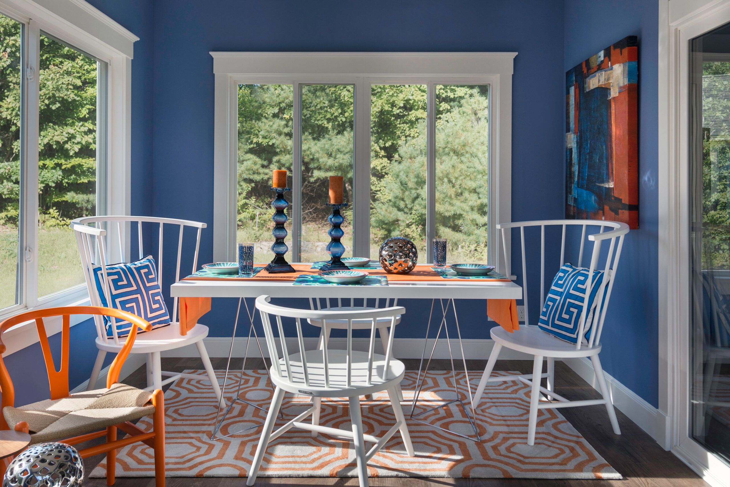
3. Use the 60-30-10 Rule
This classic design principle helps balance colour in any room:
60% of the space should be the dominant colour (usually walls or large furniture)
30% should be a secondary colour (furniture, textiles)
10% should be an accent colour (cushions, artwork, small décor)
If your current décor already includes bold or vibrant colours, opt for a more subdued paint colour for balance. If your space is mostly neutral, a rich wall colour can become the statement.
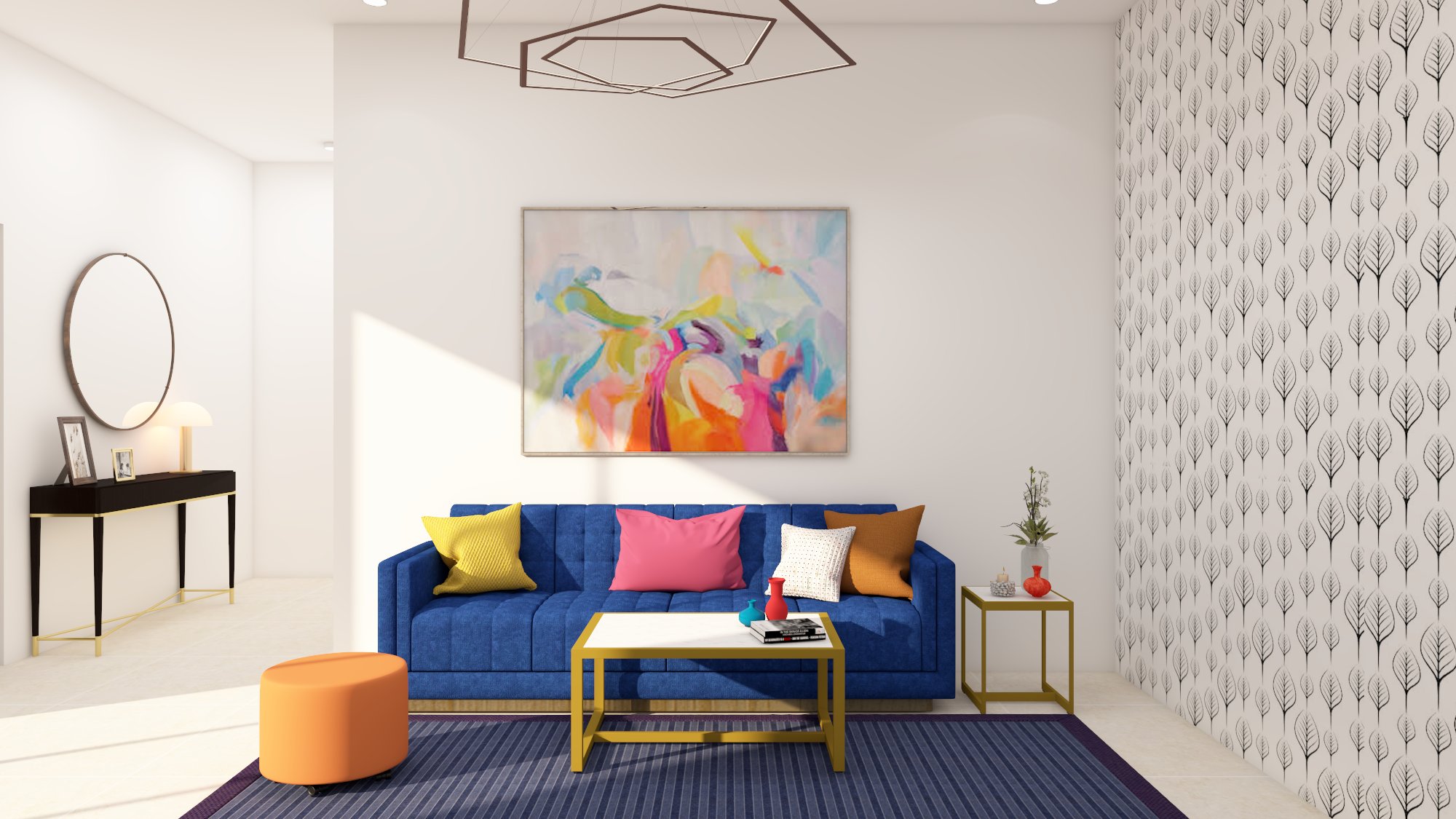
4. Match Paint to Key Pieces, Not the Whole Room
Instead of trying to match your paint to every item in the room, focus on one or two standout elements—like a patterned sofa, a vintage rug, or a piece of artwork.
Pull a subtle colour from that item and use it as inspiration. For example, if your rug has deep navy accents, consider a soft grey-blue for the walls to create visual flow. You don’t have to go literal—complementary tones are just as effective as matching ones.
5. Consider Natural and Artificial Lighting
Lighting plays a huge role in how paint colours appear. A colour that looks beautiful under bright sunlight might appear dull or too dark at night.
North-facing rooms tend to have cooler, softer light—warm paint colours can help balance this.
South-facing rooms get lots of natural light—both warm and cool colours can work here.
Rooms with little natural light may benefit from lighter or warmer tones to create a cosier atmosphere.
Always test paint samples on multiple walls and view them at different times of the day before making your final decision.
6. Create Flow Between Rooms
In open-plan layouts or connected spaces, coordinated paint colours help maintain a sense of unity. You don’t need to paint every room the same colour, but aim for shades that complement one another when viewed together.
Try using:
Different shades of the same colour family across rooms
Neutral base tones with varying feature walls
Colour bridges, like a navy hallway that leads into a room with pale blue walls
Using trim, doors, or ceilings in the same shade throughout the home also helps visually connect different areas.
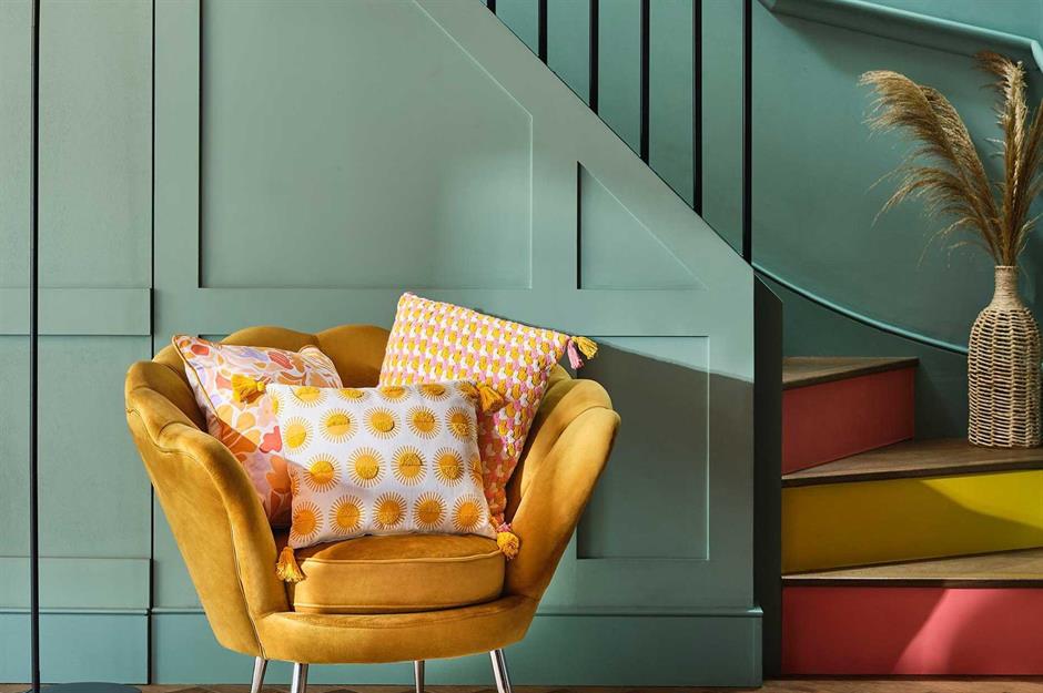
7. Neutral Doesn't Mean Boring
Many people opt for neutrals when trying to match existing décor—but neutral doesn’t have to mean bland. High-quality neutral paints offer incredible depth and warmth, pairing beautifully with both modern and traditional styles.
Consider:
Warm greys with taupe or beige undertones
Soft whites with a hint of cream
Greige (a blend of grey and beige) for ultimate flexibility
Neutrals also give you more freedom to experiment with bold accessories or future changes in décor.
8. Don’t Forget the Finish
Even the perfect colour can feel wrong if the finish doesn’t suit the room’s function. When coordinating paint with décor, choose the appropriate sheen:
Flat/matte: Great for bedrooms and low-traffic areas; provides a soft, elegant look
Eggshell/satin: A versatile option that’s easy to clean; ideal for living rooms and dining areas
Semi-gloss: Perfect for kitchens, bathrooms, and trim; offers durability and a hint of shine
The finish affects how light reflects in the room, which in turn impacts how colours are perceived.
9. Sample Before You Commit
Never rely solely on paint chips or online visuals. Once you've narrowed down your options, purchase sample pots and apply them directly to the wall. Paint swatches in large sections—at least 1x1 ft—and observe them in morning, afternoon, and evening light.
It’s also helpful to tape samples next to furniture and décor pieces to see how the tones work together.
These are just a few tips for choosing the perfect paint colour. Remember to take your time, trust your instincts, and most importantly, have fun with it!
5 Things to Avoid When Choosing Paint Colours
Choosing paint colours can be tricky, but avoiding these common mistakes can save you trouble. First, don’t ignore lighting! Natural and artificial light can change how a colour looks in your space. Always test samples to see how they appear at different times of the day. Skipping sample testing altogether is another frequent misstep.
Test patches ensure the shade works with your room. Don’t clash with existing décor; consider your furniture and accessories to create harmony. Avoid blindly following trends, as they may not suit your home or long-term plans.
Finally, remember the room’s purpose. For example, bright colours may energise a playroom, while soft tones can create a relaxing bedroom. Thoughtful choices make a world of difference!
Seeking a Professional Interior Painter in Edinburgh? Choose Capital Painters!
When it comes to transforming your interior spaces with a fresh coat of paint, Capital Painters in Edinburgh is the trusted team for exceptional results.
Our highly skilled Interior Painters and Decorators are committed to delivering high-quality outcomes that exceed expectations. From precise painting techniques to intricate decorative finishes, we ensure meticulous attention to detail at every stage of the process. Whether your vision is bold and modern or classic and sophisticated, we collaborate closely with you to bring it to life.
In addition to our interior painting services, we also offer exterior painting solutions designed to enhance your property’s appearance. Our team is experienced in both traditional brush painting and advanced spray painting techniques, ensuring a durable, flawless finish that can withstand Scotland’s challenging weather conditions.
Discover the difference Capital Painters can make by requesting a free quote for your next project. Contact us today to explore our services and learn how we can help you achieve your ideal interior.
FAQs
How does colour theory help when choosing paint colors?
Colour theory helps you understand how different paint colors interact. Using the colour wheel, you can choose analogous colours like blue green, blue violet, or yellow green to create harmony throughout your home. This makes coordinating with soft furnishings much easier.
Can I use darker colours without overwhelming a space?
Yes, darker colours can add depth and elegance when balanced correctly. Pairing one colour from the colour palette with lighter tones or soft furnishings that reflect light helps prevent the space from feeling too enclosed.
What are analogous colours and how do they work?
Analogous colours are three colours that sit next to each other on the colour wheel—like red orange, yellow green, and blue green. These shades work well together and can help you build a cohesive colour palette throughout your home.
Should I base my palette on just one colour?
Starting with one colour as your anchor can make selecting coordinating paint colors easier. Then use colour theory to build on that with analogous colours and complementary shades, ensuring a unified look that reflects light and complements your décor.
Conclusion
Coordinating paint colours with your décor is a fun and rewarding way to design a space that feels cohesive and personal. By matching colours with your furniture, accessories, and lighting, you can create a room that’s balanced and inviting.
Don’t forget to test out paint samples to see how they look in your space, and think about how bold and neutral tones work together. Also, keep the room’s purpose in mind while making your choices!
If you’re in Edinburgh and need a skilled, reliable painting service, Capital Painters & Decorators has you covered. Our expert team is passionate about delivering top-notch results, transforming homes and businesses alike with care and precision.
Whether it’s interior or exterior painting, we’re here to make your vision a reality. Ready to get started? Contact us today for a free consultation and let us help you bring your property to life!