Choosing the Right Colour Palette for Your Living Room

Your living room is the heart of your home. It’s where you relax after a long day, entertain guests, or spend quality time with family. One of the most impactful elements that defines its atmosphere is the colour palette.
The colours you choose not only shape the look and feel of the space but also influence mood, comfort, and even how large or small the room feels. Selecting the right colour palette isn’t just about choosing a favourite shade—it’s about balance, harmony, and creating a cohesive design that complements your lifestyle.
In this comprehensive guide, we’ll explore how to choose the right colour palette for your living room, covering everything from colour theory and trends to practical tips and inspirational ideas.
Understanding the Basics of Colour Theory
Before diving into paint swatches and fabric samples, it helps to understand some basic principles of colour theory.
The Colour Wheel
The colour wheel is your best friend when designing interiors. It’s divided into:
Primary Colours: Red, Blue, Yellow
Secondary Colours: Green, Orange, Purple (created by mixing primary colours)
Tertiary Colours: Variations like teal, coral, and chartreuse, formed by mixing primary and secondary colours
Understanding the relationships between these colours helps you decide on complementary, analogous, or monochromatic schemes.
Colour Temperatures
Colours are generally classified as:
Warm Tones: Reds, oranges, and yellows—these create energy and warmth.
Cool Tones: Blues, greens, and purples—these evoke calm and serenity.
Neutrals: White, black, grey, beige—these are versatile and timeless.
The temperature of a colour can dramatically affect the ambience of your living room. Warm colours can make a large room feel cosier, while cool tones can make a small space feel more open.
Benefits of Seasonal Home Décor

Seasonal home décor not only adds a touch of personality and style to your living space, but it also offers a range of benefits. Here are some reasons why incorporating seasonal décor into your home is beneficial:
Promotes mindfulness: By regularly updating your décor to reflect the changing seasons, you become more mindful and in tune with the passing of time. It serves as a reminder to be present and appreciate the beauty in each season.
Encourages creativity: Seasonal home décor allows for creativity and personal expression. You can mix and match different colours, textures, and themes to create a unique look that reflects your individuality.
Adds variety: Changing up your home décor with the seasons prevents monotony and keeps your space feeling fresh and exciting. It also allows you to experiment with different styles and trends without making a long-term commitment.
Boosts mood: Seasonal décor can have a significant impact on our mood. For example, vibrant spring colours can bring a sense of joy and renewal, while cosy autumn décor can create a warm and inviting atmosphere.
Enhances seasonal activities: With seasonal home décor, you can set the scene for various seasonal activities such as hosting holiday parties or getting cosy by the fireplace during winter. It adds an extra layer of ambiance and makes these events more special.
Choosing the Right Colour Palette for Your Living Room
Now that we understand the basics of colour theory and how different hues can affect our emotions, let's dive into choosing the right colour palette for your living room. When it comes to designing a space, colours play a crucial role in setting the mood and creating a cohesive look. Here are some steps to help you select the perfect colour palette for your living room.
Step 1: Consider Your Living Room’s Purpose and Mood
Before choosing colours, ask yourself: What do I want my living room to feel like?
Relaxing and calm? Go for cool tones like soft blues or gentle greens.
Cosy and inviting? Opt for warm neutrals like caramel, terracotta, or mustard.
Elegant and sophisticated? Try monochromatic schemes with rich greys, navies, or forest greens.
Bright and cheerful? Choose light-reflective hues such as pastel yellows, coral, or aqua.
The psychological impact of colour is profound. For example, blue promotes relaxation, making it great for unwinding. Yellow brings optimism, while green adds balance.
Step 2: Assess Natural Light and Room Size
Natural light greatly affects how colours appear in a room.
South-Facing Rooms
These rooms enjoy warm, bright sunlight most of the day. They can handle cooler tones without feeling cold. Try dusty blues, sage greens, or even charcoal greys for contrast.
North-Facing Rooms
These tend to receive cooler, limited light. To avoid a gloomy look, go for warm hues—think creams, taupes, or soft peach tones.
East/West-Facing Rooms
Light changes throughout the day. Choose flexible tones like soft white, beige, or muted greens that adapt well to shifting light.
Room Size Matters
Small Rooms: Light colours such as off-white, pale greys, or soft pastels make a space feel bigger.
Large Rooms: You can afford to go bolder with darker shades like navy, emerald, or even black accents.
Step 3: Start with a Base Colour
The base colour is the anchor for your palette and will dominate the room. This could be the colour of your walls, flooring, or largest furniture item like a sofa.
Choose a neutral if you want longevity and versatility. Shades like warm grey, cream, or stone provide a blank canvas that allows you to refresh the space easily with accessories.
If you’re bolder, your base could be a colour like olive green, dusty blue, or even a deep burgundy, which can be paired with complementary accents to create a cohesive look.
Step 4: Build Your Palette Using the 60-30-10 Rule
This classic design principle is a simple formula for balanced colour usage:
60% Dominant Colour: Typically walls, large rugs, or major furniture.
30% Secondary Colour: Upholstery, curtains, or accent chairs.
10% Accent Colour: Cushions, artwork, lamps, or decorative pieces.
For example, a neutral beige sofa (60%), navy armchairs (30%), and mustard cushions (10%) would make a dynamic yet harmonious space.
Step 5: Consider Fixed Elements
Look at what you can’t or won’t change—flooring, fireplace, built-in cabinetry, or large furniture pieces. Their tones and textures will guide your palette.
Wood Tones: Warm woods like oak or cherry pair beautifully with warm neutrals or earth tones.
Stone or Brick: Natural materials offer texture and colour that can dictate whether you lean warm or cool.
Metal Finishes: Brass or gold lends itself to warmer palettes, while chrome or silver fits cooler schemes.
Step 6: Choose the Right Paint Finish
The finish of your paint affects both appearance and practicality.
Matt or Flat: Best for walls; hides imperfections well but is less durable.
Eggshell: Slight sheen, easy to clean—great for high-traffic areas.
Satin: More reflective, works well for trims and doors.
Gloss: Very shiny—ideal for accents or detailing.
Choose finishes based on lighting, wall condition, and desired texture.
Step 7: Incorporate Texture and Layering
A successful colour palette isn’t just about paint. Layering various textures in similar or contrasting tones adds depth and interest.
Textiles: Use rugs, throws, and curtains to introduce or echo colours.
Furniture: Mix wood, metal, and upholstered pieces in harmonious hues.
Art and Accessories: Integrate your accent colours through wall art, ceramics, and décor items.
Texture enhances your colour scheme and makes the room feel complete.
Step 8: Test Before You Commit
Paint swatches often look different on walls than they do in the tin or shop lighting. Always test your shortlisted colours at home.
Paint large sample areas on different walls.
Observe them in morning, afternoon, and evening light.
See how they interact with your furniture and flooring.
You may find a colour looks perfect in natural daylight but dull in artificial lighting—or vice versa.
Step 9: Draw Inspiration from Trends (But Don’t Rely on Them)
While it’s tempting to go with what's fashionable—like earthy terracotta, moody greens, or warm neutrals—it’s more important to choose colours you genuinely love. Trends come and go, but your living room is a long-term investment.
That said, you can incorporate trend colours in smaller, changeable elements like cushions, artwork, or accent chairs if you want to stay current without committing to a full room repaint.
These are just a few tips to help you choose the perfect paint colour for your living room. Remember, it’s all about finding colours that speak to you and create a space that you feel comfortable in.
Additional Steps for Choosing the Perfect Paint Colour

Here are a few more steps you can take to make sure you choose the perfect paint colour for your living room:
Consider the lighting in the room: Natural light, artificial light, and even wall colour can all affect how a paint colour looks in a space. Before making your final decision, test out different colours at different times of day and see how they look under different types of lighting.
Take inspiration from existing elements: If you have furniture or décor pieces that you love and plan on keeping, use them as inspiration for your paint colour choice. Pull out colours from patterns or textures in these items to create a cohesive and visually appealing space.
Think about the mood and atmosphere you want to create: Paint colours have the power to affect our emotions and the overall feel of a room. Warm tones like red, orange, and yellow can create a welcoming and cosy atmosphere, while cool tones like blue, green, and purple can bring a sense of calmness and serenity. Consider the purpose of the room before choosing a paint colour – do you want it to be energising or relaxing?
Don't be afraid to go bold: While neutral colours are always a safe choice, don't shy away from using bold or vibrant shades if that's what your heart desires. Just make sure to balance out bright colours with more neutral elements in the room.
Use different shades of the same colour: To add depth and dimension to a room, consider using different shades of the same colour. For example, if you choose a light blue for the walls, incorporate darker shades of blue in furniture or décor.
Seasonal and Trend Considerations
Seasonal changes can have a big impact on how your living room looks and functions. During winter, go for warm, cosy tones like deep reds, burnt oranges, or rich emerald greens to create a snug atmosphere.
When summer arrives, lighter, breezier shades like soft blues, crisp whites, or pale yellows can make the space feel fresh and airy. You don’t need to completely revamp your living room each season; simply swap out accessories like throw cushions, curtains, or rugs to reflect the time of year.
When it comes to trends, it’s easy to get caught up in what’s popular. Whether it’s pastel greens or bold jewel tones taking centre stage, focus on incorporating those colours through smaller, replaceable items. Stick to timeless, neutral shades for larger investments like walls or furniture to ensure longevity. This way, you can stay stylish without committing to a look that might feel outdated in a few years. Practical, stylish, and adaptable—that’s the key!
5 Common Colour Mistakes to Avoid

Choosing the perfect colour palette for your living room can be tricky, and these common mistakes often catch people out:
Ignoring Lighting: Colours look different in natural vs. artificial light. Always test paint samples at different times of day to see how they appear.
Overusing Bold Colours: While vibrant hues are fun, too much can feel overwhelming. Balance bold colours with neutrals to create harmony.
Skipping the 60-30-10 Rule: This guideline keeps designs cohesive. Use 60% of a dominant colour, 30% of a secondary shade, and 10% for accents like cushions or accessories.
Clashing with Furniture: Your palette must work with existing items like sofas or rugs. Choose colours that complement, not compete, with these pieces.
Following Trends Too Closely: Trendy colours can quickly look dated. Stick to timeless shades for major elements, adding trendy touches through décor you can easily update.
Plan wisely and avoid these pitfalls!
Real-Life Examples and Ideas
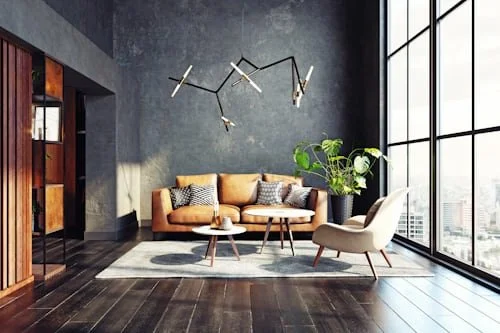
For a clean and calming aesthetic, a minimalist chic colour palette is the way to go. Stick to whites, beiges, and soft greys for a serene vibe. Pair a neutral beige sofa with a plush white rug, and add metallic accents like silver or chrome side tables for a modern touch. To keep the space cosy, incorporate textures such as knitted throw blankets or velvet cushions.
If you prefer a bold, modern look, opt for a striking combination of navy, mustard yellow, and crisp white. Create depth by painting an accent wall navy, then add a pop of colour with a mustard yellow armchair. Complement these bold tones with a white leather sofa, and tie the room together with geometric patterned cushions and a vibrant abstract painting for a statement-making space.
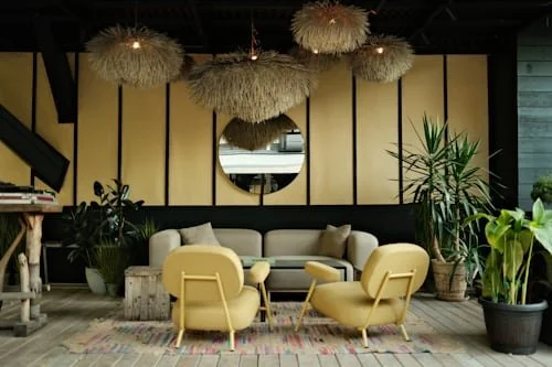
For a warm, earthy feel, embrace forest green, terracotta, and cream. A forest-green sofa paired with a terracotta rug and cream curtains creates a grounded, natural ambiance. Enhance the look with woven baskets, wooden accents, and other nature-inspired details. Ultimately, your personal style and preferences should guide your choices—don’t hesitate to experiment and mix different shades to craft a space that feels uniquely yours.
Transform Your Space with Capital Painters: Expert Colour Palettes & Flawless Finishes
Are you looking to transform your space in Edinburgh? Look no further than Capital Painters and Decorators! With an expert team of professionals, we offer a wide range of services to meet all your painting and decorating needs.
We understand the importance of choosing the perfect colour palette for your space and our team is here to guide you through the process. From modern and contemporary to classic and traditional, we have the expertise to bring your vision to life.
But it's not just about choosing the right colours - we also ensure flawless finishes that will leave your space looking stunning. Our surface preparation and restoration services guarantee a smooth and long-lasting result.
Contact us now to schedule a consultation and let us transform your home or business with our professional painting services. We also offer flexible scheduling options to minimise any disruption to your daily routine.
FAQs
What makes a neutral colour palette a good choice for a living room?
A neutral colour palette is timeless and works well in any space. It’s perfect for a neutral living room because it creates a calm, clean look that’s easy to decorate around. You can also add bright colors or a bright hue as accents without overwhelming the space.
How do I create the best living room color scheme?
Start with a base of cool shades or a lighter shade to open up the room. Then, add contrasting colours or bright colors for balance and interest. The best living room color scheme reflects your style while keeping the space comfortable and welcoming.
Can all the colours work together in one living room?
Yes, all the colours can work together if used thoughtfully. A well-balanced color palette includes a mix of cool shades, a lighter shade, and a few bright hue accents. Pairing them with a neutral colour palette helps everything blend nicely in your living room.
Should I use contrasting colours or stick to a neutral living room?
Both options work—it depends on your style. A neutral living room offers calm and flexibility, while contrasting colours and bright colors add personality. Try starting with a neutral colour palette and using a bright hue or bold detail to add interest.
Conclusion
Designing the perfect living room starts with choosing the right colour palette—and it’s about more than just picking your favourite shade. By understanding colour theory, you can use warm and cool tones to set the mood, while the 60-30-10 rule ensures balance. Considering natural light, room size, fixed elements, and paint finishes helps you avoid mistakes and guarantees a space that looks great all day.
Seasonal décor brings variety, boosts your mood, and lets your home evolve year-round, while layering textures and testing colours ensures a cohesive look. Avoiding common mistakes—like ignoring lighting or overusing bold hues—makes all the difference.
In the end, your living room should reflect your personality and lifestyle. Whether you want a calming retreat or a bold, modern space, Capital Painters can help bring your vision to life with expert guidance and flawless execution. From colour advice to professional finishes, we turn ideas into reality—beautifully and seamlessly.